Pizza Hut is going back to its roots and is reminding everyone who has the best original pizza in town. They are changing their logo back to the old one. Pizza Hut chief brand officer Marianne Radley has spoken on why they’ve decided to change the logo. “It’s about celebrating where we came from.”
The chain, founded in 1958, will be displaying the old, nostalgic logo during NFL promotions in the fourth quarter of the year. The transition to the old-style look will be surfacing on digital media within the next few weeks!
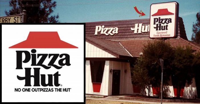
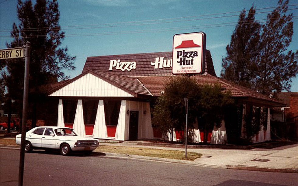
Old Pizza Hut logo from the ’60s and ’70s

The old logo will first be appearing for a TV ad campaign. They’ll be advertising the limited-time return of Cheesy Bites Pizza. “We have to be a little braver, a little bolder in our choices,” Radley says, as Pizza Hut sales have reportedly been “sluggish.” They soon realized after much research that nostalgia-based marketing strategies tend to have a great response.
The old logo that will be rolling out on packaging everywhere soon enough was widely seen throughout the ’60s and ’70s.

The current Pizza Hut logo displays the classic Pizza Hut roof in white, with white lettering on top of the red background. The older logo definitely brings back more of a ‘pop,’ Radley says, with its red roof and bold, black text. Who could ever forget their slogan, “No one outpizzas the hut”?
“Red roof is an iconic asset,” Radley says, “It’s a brand tone change, not an infrastructure change.”

Are you excited for Pizza Hut’s nostalgic change coming up soon? What’s your favorite Pizza Hut pizza? We can’t wait for additional details on this comeback!
