How many company logos do you think you see per day? When you are out shopping or online, you see so many that you probably barely look at them. You think you know what your favorite companies and brands logos really mean, but many have hidden messages.
Here are some hidden messages in logos that you may have never realized. See how many your friends know!
1. Baskin Robbins
Look Closer At the B and the R
.

Wikimedia Commons
See The 31?
Pretty simple, right? BR… Baskin Robbins. Do you see the 31 hidden in there in pink lettering in the ‘BR’? The number 31 stands for their original 31 flavors. Baskin Robbins wanted to have one flavor for every day of the month when they opened in 1953
2. Amazon
Notice Anything About Where That Arrow Is Pointing?

Wikimedia Commons
Think About The Alphabet
Amazon is growing in popularity every day. The logo is the word Amazon with a smile underneath, right? Nope! It is actually an arrow pointing from A to Z. This shows that Amazon has a huge variety of products in their online store.
3. Apple

Okay, There’s A Bite…

This One’s A Little More Subtle
The logo of the popular cell phone retailer is a simple apple with a bite taken out of it. Why is the bite mark there? They wanted a bite mark so that even if the logo becomes tiny, it would still look like an apple and not a cherry
4. FedEx

Look Between The E and X

Arrow And Bullseye
FedEx’s logo is pretty simple. It just says FedEx, sometimes with the word Express. Do you see the arrow in the logo? Look between the ‘E’ and the ‘x’. It descibes their pledge to expedient and diretness. Bet you never noticed that before!
5. Toblerone

There Appears To Be A Creature In That Mountain
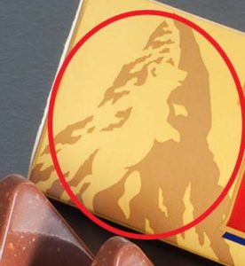
Yikes, A Bear!
Don’t you just love Toblerone chocolate? The Toblerone logo features the word and a mountain. Look closely at the mountain. Do you see a bear? The bear is the official symbol of Bern, a town in Switzerland which is the home of Toblerone.
Read on to the next page to find out what other logos have hidden meanings!