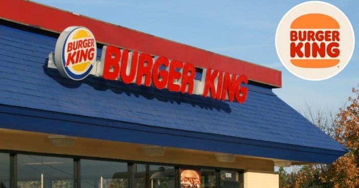
Burger King is getting its first brand redesign in 20 years. According to Simple Most, “The new identity includes a new logo, packaging, restaurant merchandise, menu boards, uniforms, restaurant signage and decor, plus social media, digital and marketing assets.” They are going back to the ’70s for the new designs.
Burger King has promoted its new design with a new profile picture on social media. The tweet read, “out with the old, in with a new classic.” The logo is simple with the words Burger King in red, in the middle of two buns. It certainly does look retro!
Check out Burger King’s new ’70s style logo
out with the old, in with a new classic #NewProfilePic pic.twitter.com/y2eRT9qqO6
— Burger King (@BurgerKing) January 7, 2021
Burger King is also hoping to promote fresh ingredients since many people have a negative view of fast food. The logo before the new design had been in place since 1999, so it was definitely time for a change for the fast food brand!
RELATED: Burger King Debuts Giant Social-Distancing Crowns To Keep Customers Apart
This is the right way to do a rebrand. pic.twitter.com/I1YLkhpWB0
— Mitch Goldstein (@mgoldst) January 7, 2021
Fans commented that the logo looks very similar to the one used from 1969 to 1999. It sounds like that is what they were going for! All of the new changes will be rolled out in the next few years to all Burger King locations.
What do you think of the new, retro-looking logo?
