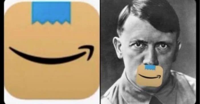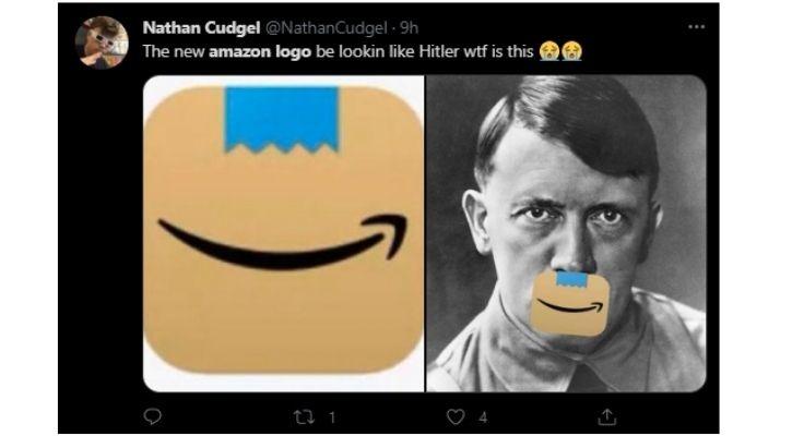
If you have the Amazon app on your phone, it’s likely you’ve noticed some changes to the app in the last few weeks. That’s because after the app updated the first time, people began comparing it to looking like Adolf Hitler. They changed it once again following those comments.
Amazon told BBC News that the app’s look had actually already been trialed in a few countries before being delivered to U.S. users. Unfortunately, it wasn’t until that release that people began noticing that the blue parcel tape made the logo look like Hitler.
Does the new Amazon logo look like Adolf Hitler? You decide
Branding agency Coley Porter Bell chief executive Vicky Bullen weighed in on the situation. “Unfortunately for Amazon, the visualisation of their parcel tape on the original logo will immediately be associated as a Hitleresque moustache, as that shape is forever embedded in our [subconscious] brains as such – not the best association for a brand that wants to create delight on the doorstep,” she says.
RELATED: Amazon Will Hire 100,000 New Workers To Deal With High Coronavirus Demand
Amazon also released a brief statement, saying, “We designed the new icon to spark anticipation, excitement, and joy when customers start their shopping journey on their phone, just as they do when they see our boxes on their doorstep.”
Most users are getting a kick out of the logo

To be fair, a lot of the comments are pretty hilarious. One user tweets, “My parents use Amazon nearly every day. They’re going to be lost for the next few days. When they ask where Amazon’s gone, I’ll tell them to look for the cardboard Hitler.”
Another said, “It’s not just a ripped Scotch tape, it’s a ripped Scotch tape that has a similar shape and is right on top of a smiling mouth – Looks like a happy little cardboard Adolf to me.” Brand designer Studio LWD founder Laura Weldon praised Amazon for listening to their customer’s comments and taking action right away. “Brands change and tweak their logos all the time. It reflects well on Amazon that they listened to their customers. It’s clear they care about what their customers say and put the customer at the heart of what they do. That can only be a good thing.”
