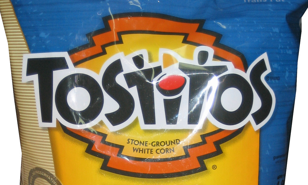
6. Tostitos

Right In Plain Sight

Friends Share Their Chips
What do the colored shapes over the ‘i’ represent? They aren’t just there for color, it represents a bowl of salsa and a chip. See how the ‘t’s’ are curved a bit? They represent people. Do you see the two people coming together to enjoy chips and salsa now? How clever!
7. Goodwill

SMILE

Notice The Matching g’s
The Goodwill logo contains half of a smiling face. Perhaps this is because it feels so good to donate items? The face is actually a larger version of the ‘g’ in the word Goodwill. Can you see it now?
8. Hershey’s Kisses

There Are 3 Kisses?

Now That I Look At It, After All These Years
How many Hershey Kisses do you see in their logo? Two, right? Wrong! There are actually three, but one is pretty hidden. Look between the ‘K’ and the ‘I’ and tilt your head slightly to the left and you will see another Kiss.
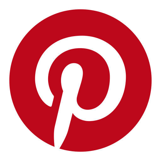
9. Pinterest

Hard To Look At It The Same

Very Pinteresting
The Pinterest logo is pretty self-explanatory. It is a giant P. However, you can see that it also has the shape of a pin, which is what you do on their website.
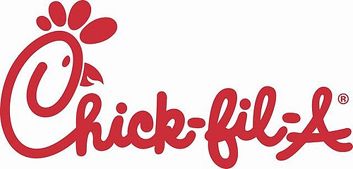
10. Chick-fil-A

Too Obvious

Although, I Love Chick-Fil-A
The logo is simply the name Chick-fil-A. Did you ever notice that the ‘C’ has been drawn to look like a chicken? It all comes together perfectly!
11. Gillette

You Have To Be Sharp To Get This One

Ouch!
This is another logo that simply says what the brand’s name is. However, the slanted style is supposed to represent a razor sharp edge.
Did any of the hidden meanings in these logos surprise you? Can you think of any other brands with secrets in the logo?
If you enjoyed this article, please SHARE with your friends and family!