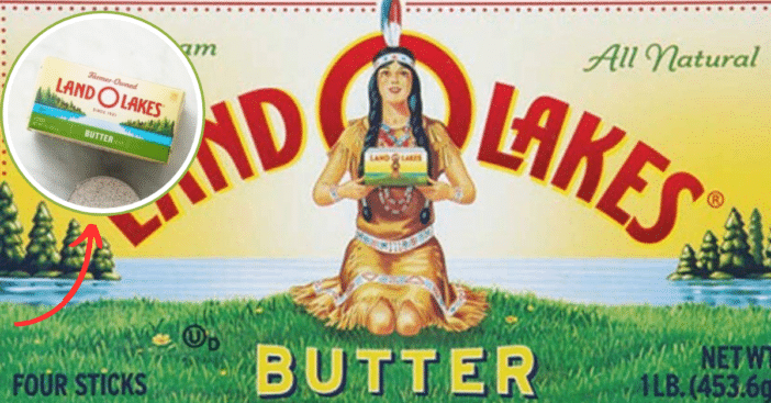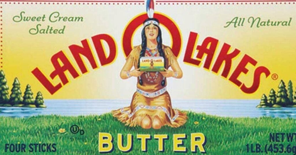
Ahead of its 100th anniversary, renowned cheese and butter company Land O’ Lakes dropped its popular logo and replaced it with a picture of its farmers to emphasize the farmer-owned nature of the cooperative and promote the brand
It took a lot of getting used to as generations of customers have been familiar with the image of a Native American woman that has graced the packaging for decades. The old logo underwent modifications over the years, but changing it totally was a first for the enterprise.
Why did Land O’Lakes remove their longtime logo?

According to the president and CEO of Land O’ Lakes, Beth Ford, the company wanted to reflect the foundation and heart of their culture. They also deemed it fit that the farmers who provide them with milk should be appreciated, hence the choice of replacement. Beth believed that was the best way to connect producers to consumers.
RELATED: Quaker Oats Renaming Aunt Jemima Products And Removing Racist Image
The original logo was designed by Arthur C. Hanson in 1928 and later retouched by Chippewa artist Patrick DesJarlait, who redesigned her dress to reflect more culture 30 years later. According to Patrick’s son Robert, the company’s decision to remove the Native American reference was a wise decision that was sure to bring about a positive reaction.

Racial boundary lines
Activists and Native American rights advocates always had a problem with the original Land O’ Lakes logo, referring to it as racist and promoting Native American people as props rather than a recognized, fairly treated group. The rebranding announcement was celebrated and, in turn, inspired the revisiting of harmful stereotypes.

The chief executive of the National Congress of American Indians, Kevin Allis, urged other corporations to take a cue from Land O’ Lakes to respect the culture and people’s roots. He pointed out via The New York Times that Americans need to embrace the beauty of tribal nations and do away with old-fashioned views like in the logo.
