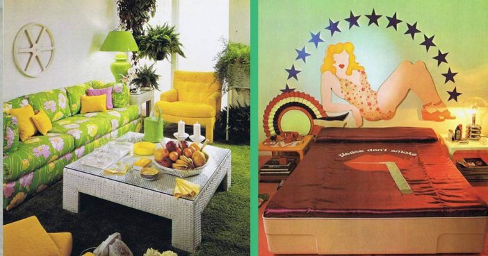
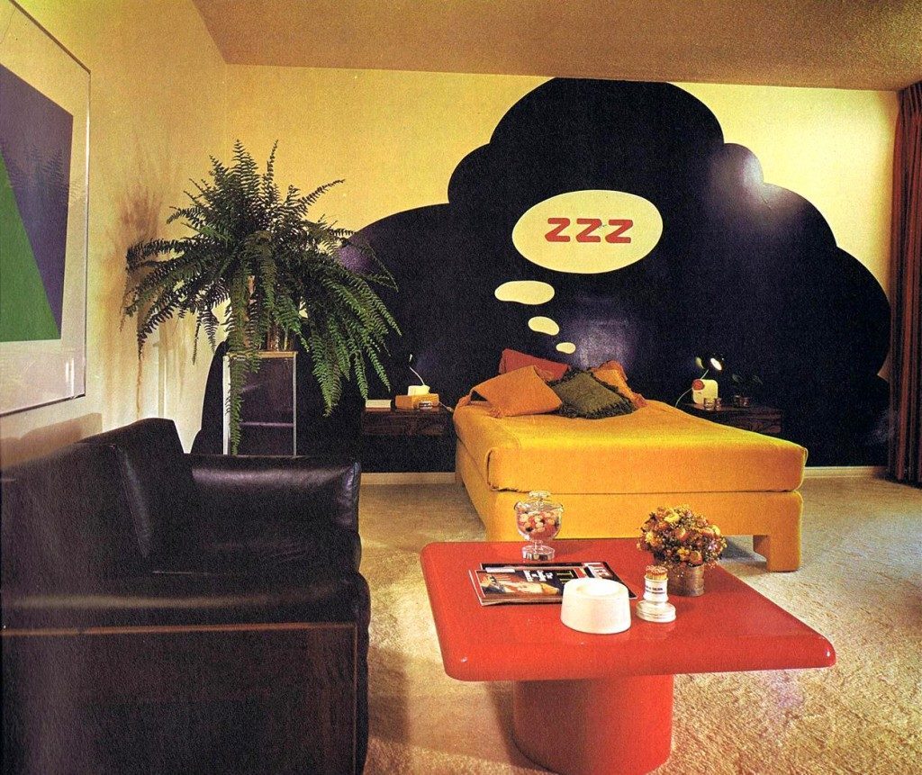
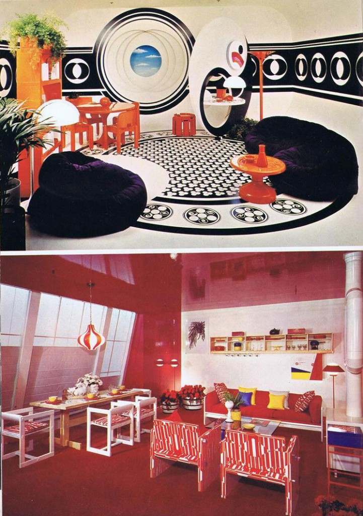
I actually dig this room. It doesn’t cross the line into over-the-top, and I think it might even work in a home of 2015. Unlike the next entry…
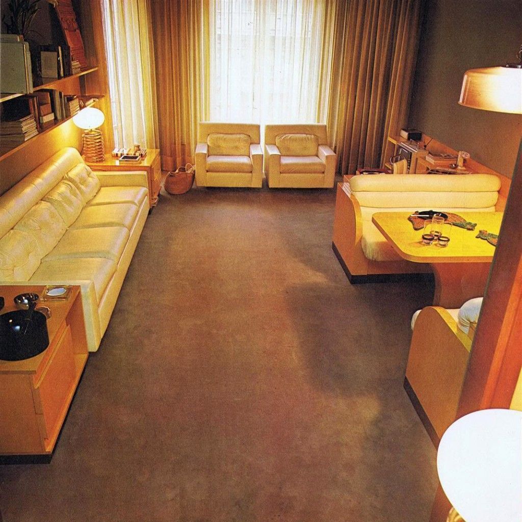
Here’s another school…
Mount Healthy School, Columbus, Indiana
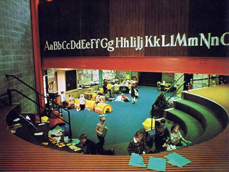
This is St. Paul’s School in St. Paul, Minnesota. I include it demonstrate just how far-reaching these trippy bold designs were. I’ll wager the teacher’s meetings held here after school hours smelled distinctly of the herb.
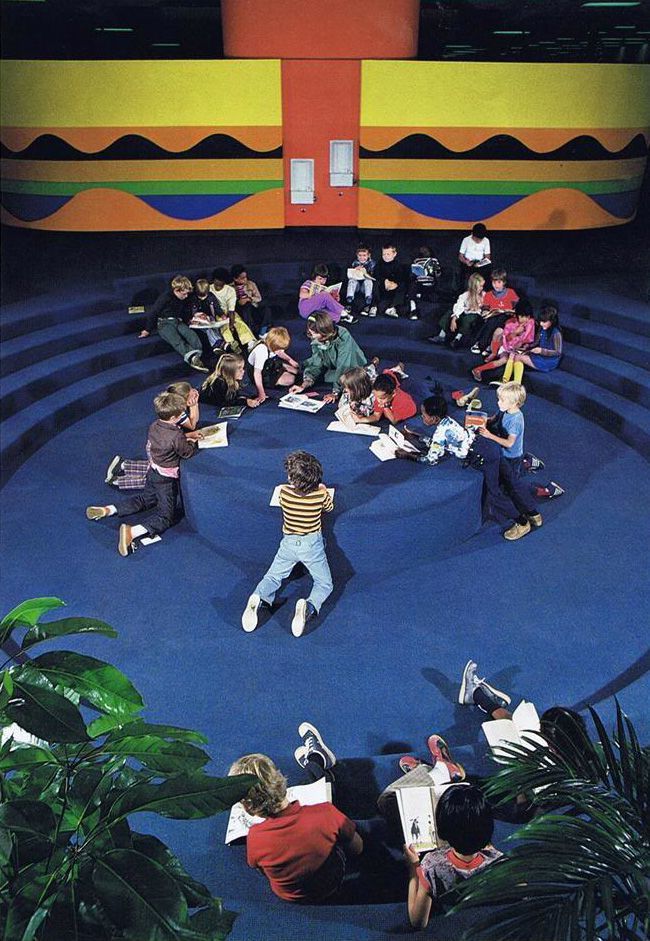
Probably not the best place to do homework or curl up with a book. But then, I don’t think that’s the intention.
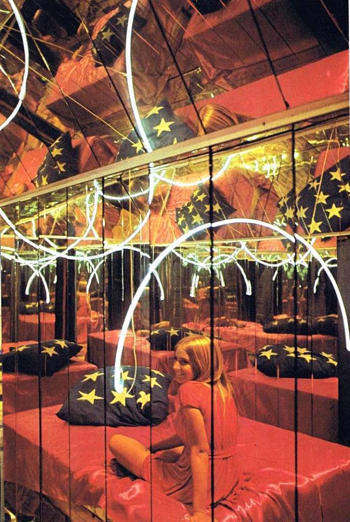
It’s easy to mock these designs, but you’ve got to give them credit for pushing the envelope. It’s easy to be conservative – there’s nothing to really point the finger at and make fun. When you push the limits, you open yourself up for ridicule, especially decades later when tastes have changed. So, as gaudy and insane as these may first appear, I have to give them respect for not being boring.
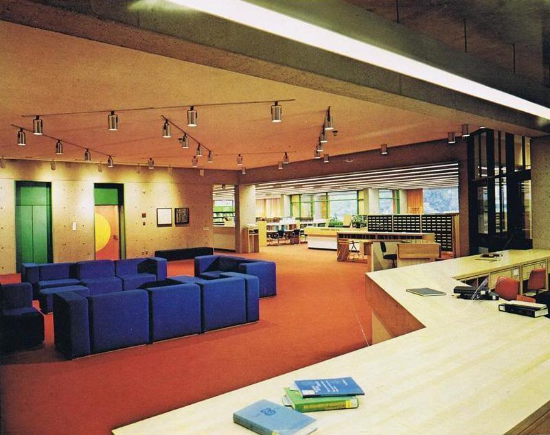
Monroe C. Gutman Library, Harvard University. A really nice blend of the “new” with the conservative. A notice to you youngsters: that structure in the background is something called a “card catalog”.
From the book: “The rooms here are a perfect example of industrial thinking at home. Inventiveness plus resourceful use of materials has transformed ordinary spaces into far-out visual trips.”

Those poor kids.
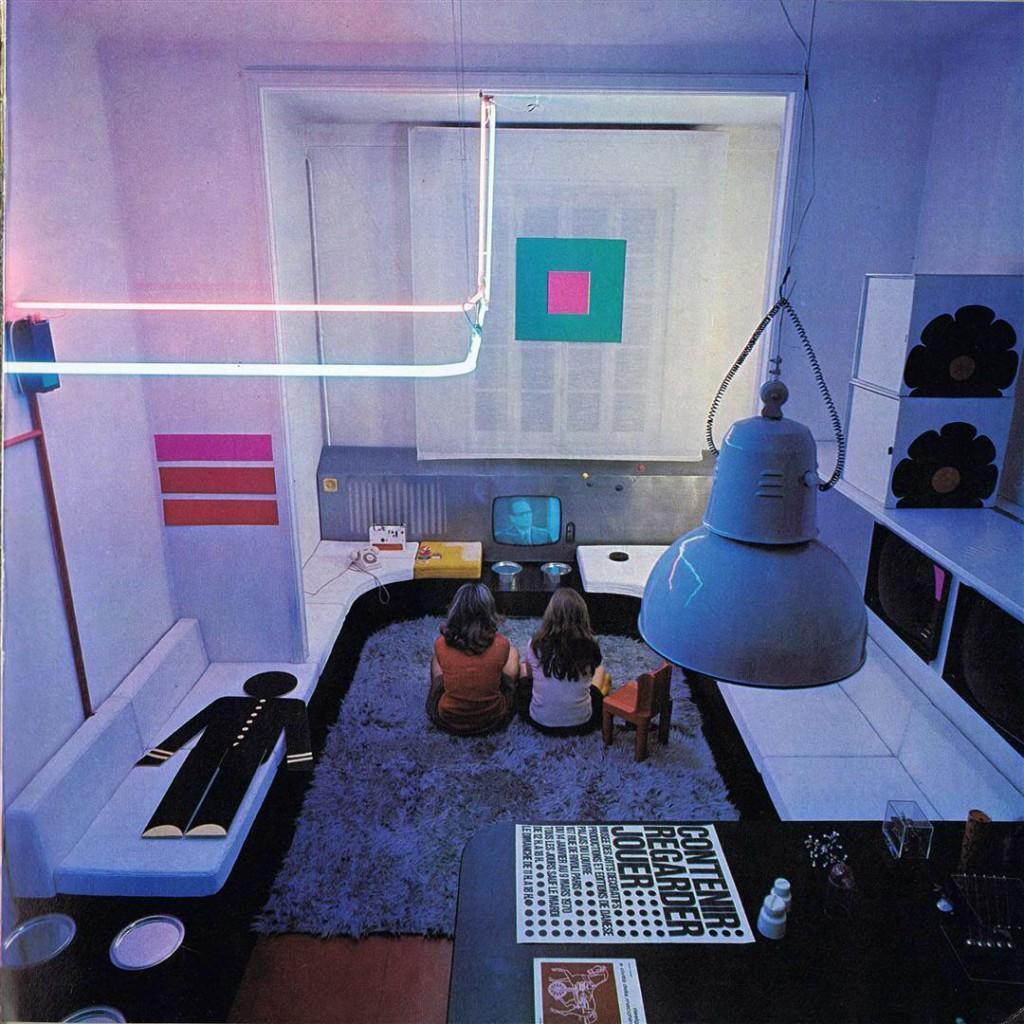
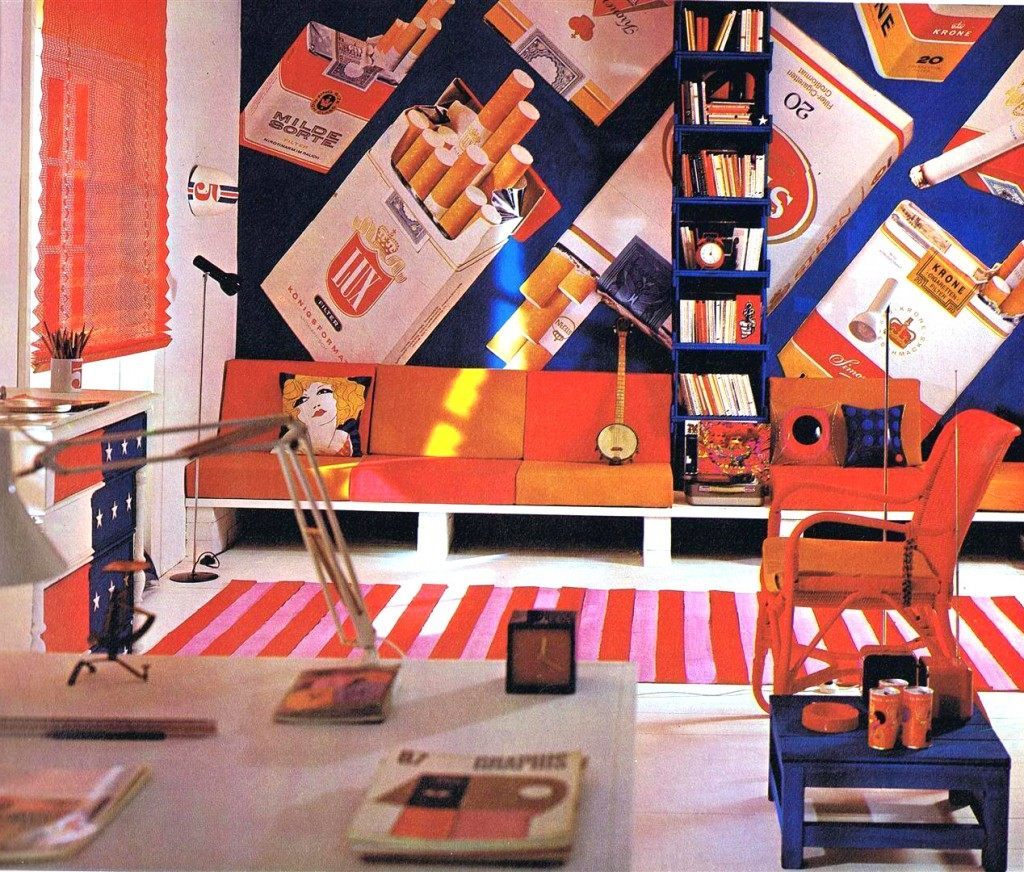
And we’ll end on my favorite. Smoke ’em if you got ’em.
Credits: flashbak.com
Share this story on Facebook with your friends.
