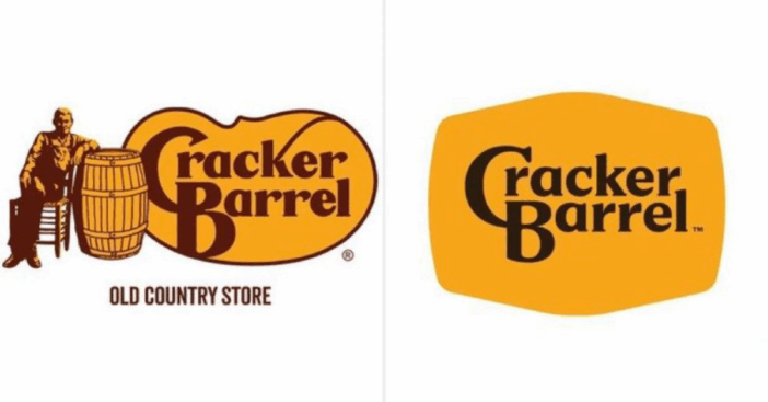
For the first time in nearly 50 years, Cracker Barrel has reimagined its iconic logo. The restaurant chain unveiled the new design this week, dropping the image of the man leaning against a barrel that had long been a familiar sight to diners. Now, the Cracker Barrel logo returns to a clean, text-only look that nods back to the brand’s earliest days.
The change is part of a broader refresh for the company, which is introducing updated visuals, new menu offerings, and a marketing campaign meant to honor its Southern roots while embracing a modern look. According to Fox News, the redesign reflects both tradition and progress, reminding longtime guests of the brand’s beginnings while moving forward into its next chapter.
A Return To Its Roots
BREAKING🚨: Cracker Barrel ($CBRL) plunged -12% after the company revealed its new logo. pic.twitter.com/ll8T5idRf4
— OnlyOptionsTrades (@OnlyOTrades) August 21, 2025
Cracker Barrel first opened in 1969 with a simple text-only design before adding the well-known man and barrel image in 1977. Now, decades later, the restaurant has stripped the visuals back to focus solely on the lettering. The updated Cracker Barrel logo keeps the familiar brown and gold tones but emphasizes the barrel shape within the word mark itself.

The company explained that inspiration even came from classic menu staples, such as farm-fresh eggs and buttermilk biscuits, which influenced the warm color palette. The fifth evolution of the logo, leaders say, reflects a balance of honoring history while making the look more versatile for modern menus, marketing, and digital platforms.
Part Of A Larger Modern Makeover
The logo’s debut is tied to Cracker Barrel’s “All the More” campaign, which not only showcases the refreshed design but also introduces new dishes and a special collaboration with country singer Jordan Davis. Davis appears in a new commercial celebrating the feeling of home that the restaurant brings to its customers.

This latest change follows updates last year when Cracker Barrel began shifting its interiors to a brighter, more modern feel while still preserving the warmth of its country hospitality. With nearly 660 locations nationwide, the company emphasizes that while the Cracker Barrel logo has changed, the brand’s values and welcoming spirit remain the same.